Making Over a Baby Friendly Living Room For a Women's Centre
To celebrate International Women’s Day this year, TSG reached out to a local women’s centre, The Abiona Centre, to see if they were in need of any design help.
“Abiona Centre is a client-centred infant and early childhood mental health organization which supports pregnant and parenting adolescents, aged 13-25. We believe in the dignity, value and potential of each young woman and baby served. With donors’ support, each young mom has access to prenatal and postnatal care, learns how to care for her baby, completes her education, and develops the skills needed to build a successful life and relationship with her baby.” - Abiona Centre
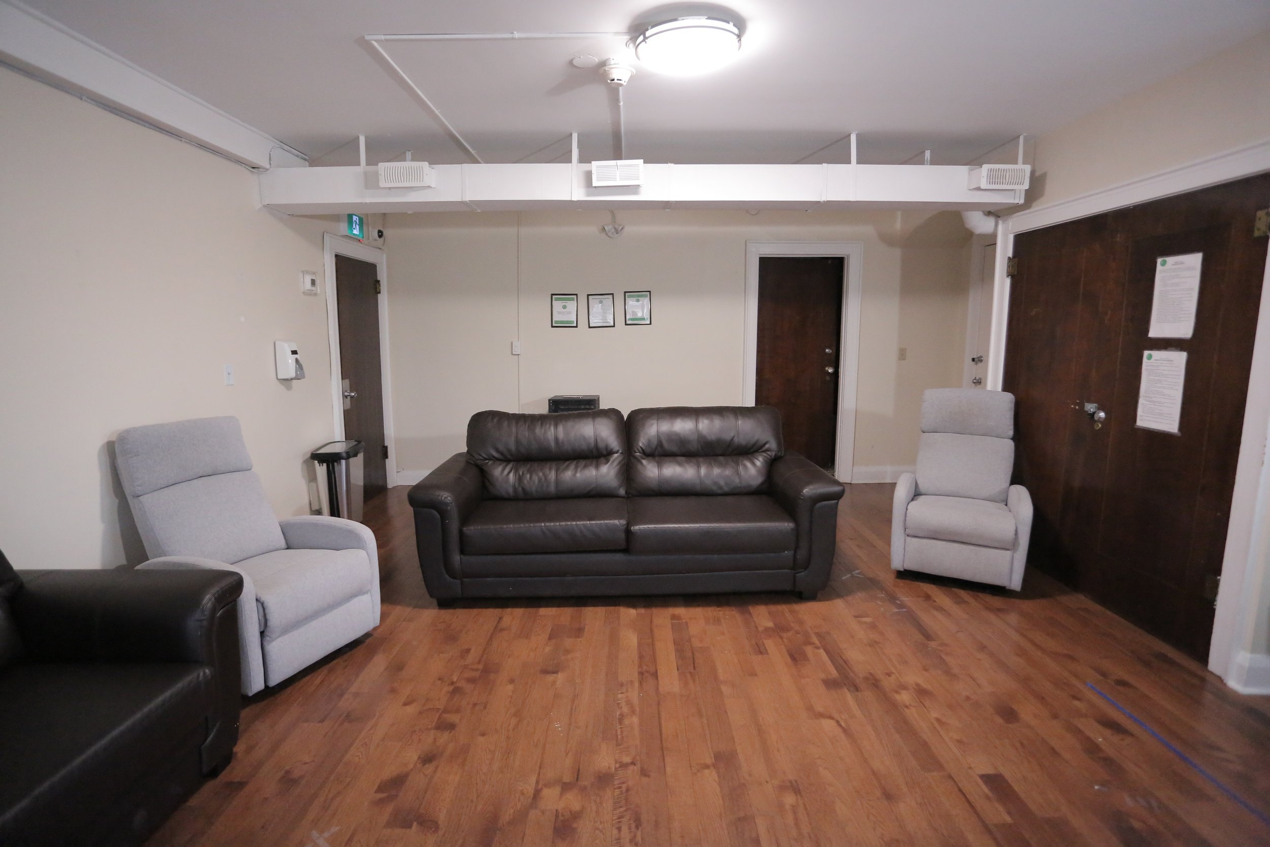
After seeing the common area the young mom’s use in their day-to-day life, we immediately knew we could transform it into a space that would make them want to get out of their rooms and hang out with the other mom’s and babies!
Before
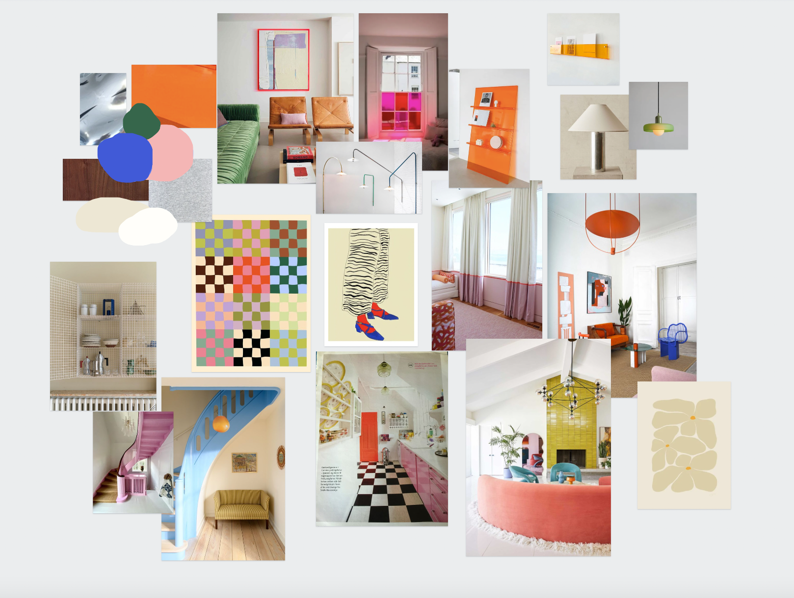
As with any makeover, first…we make a mood board.
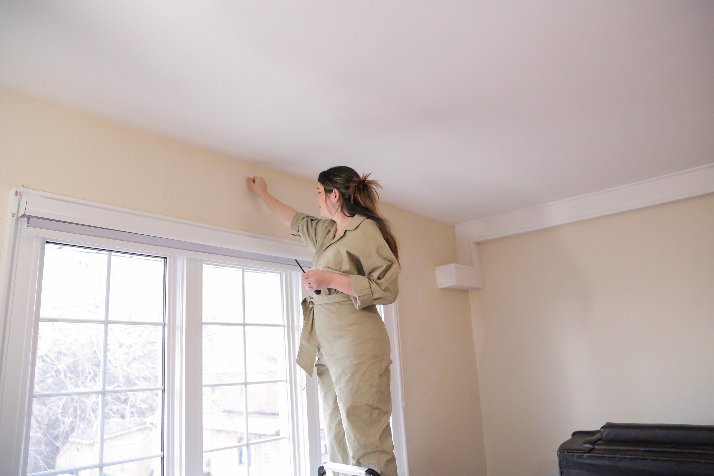
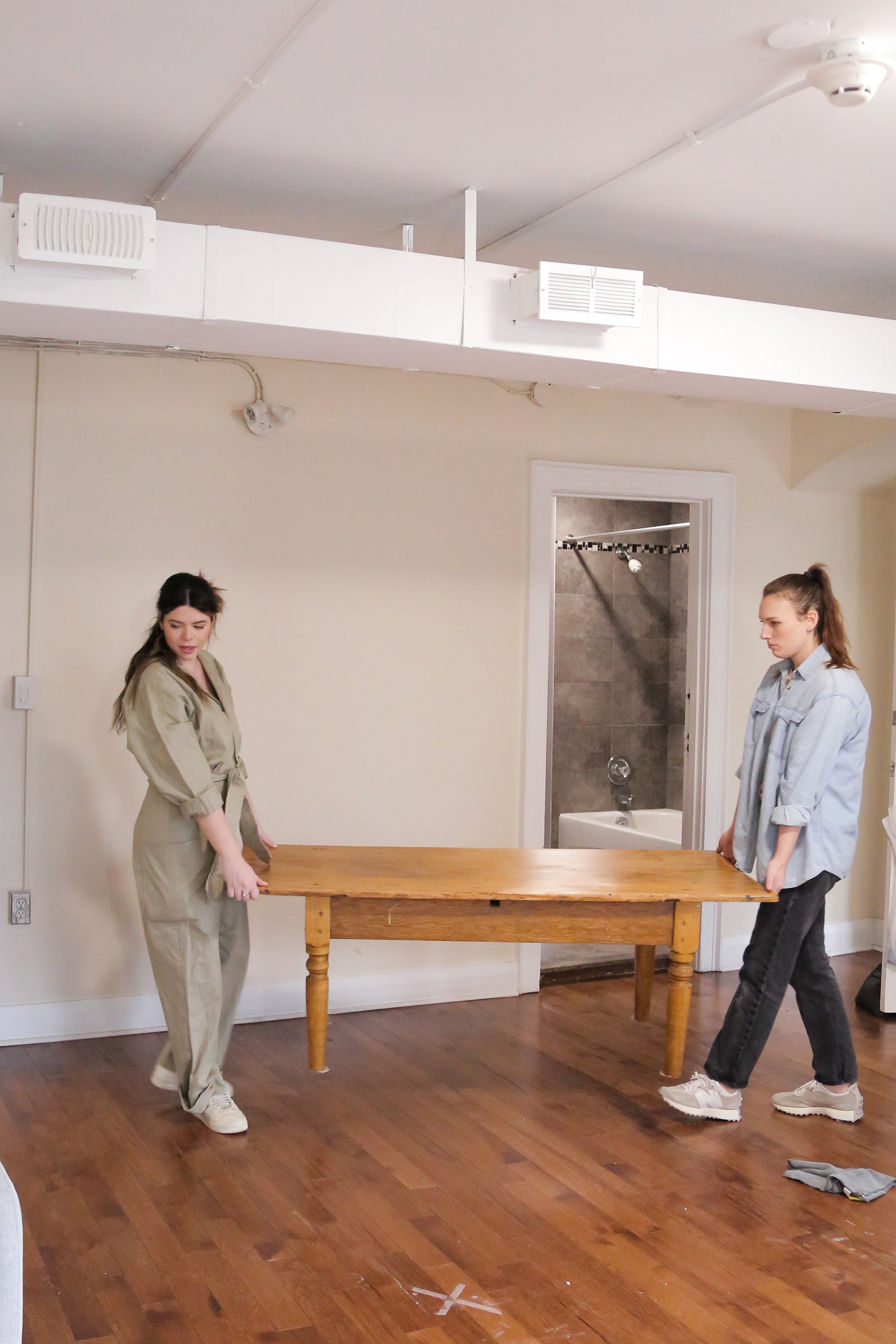
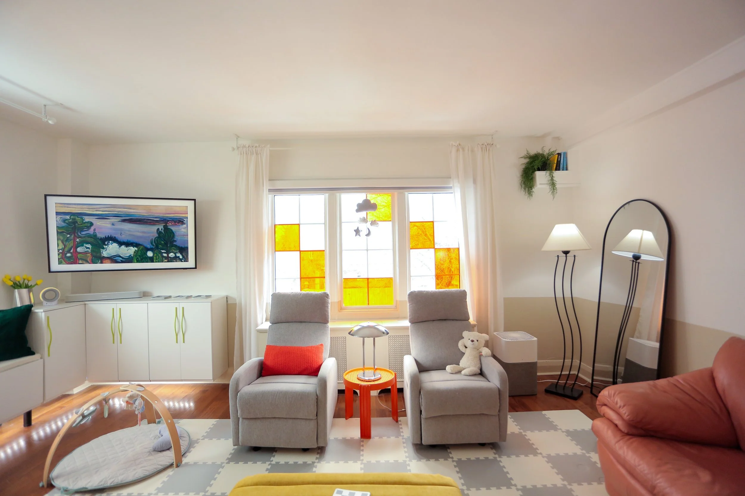
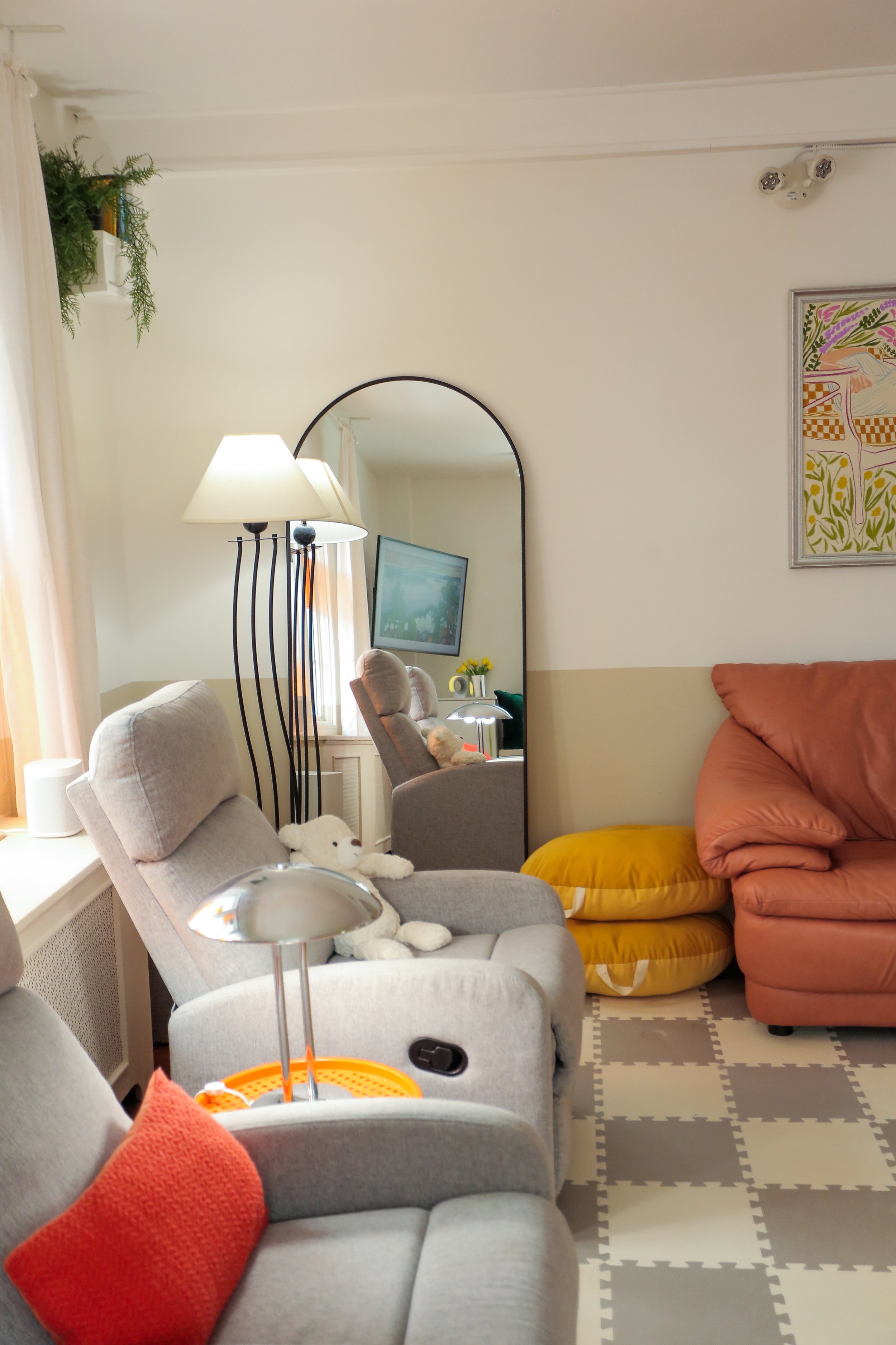
Once we had a good plan for the makeover, we cleared out the pre-existing furniture and belongings to create a blank canvas for the transformation. The walls were then repainted to freshen them up; we went with a sand-like colour on the bottom half of the wall, and a muted white on the upper half. This colour combo was a little more fun than your classic white, but also allows the decor in the room to pop by maintaining neutral.
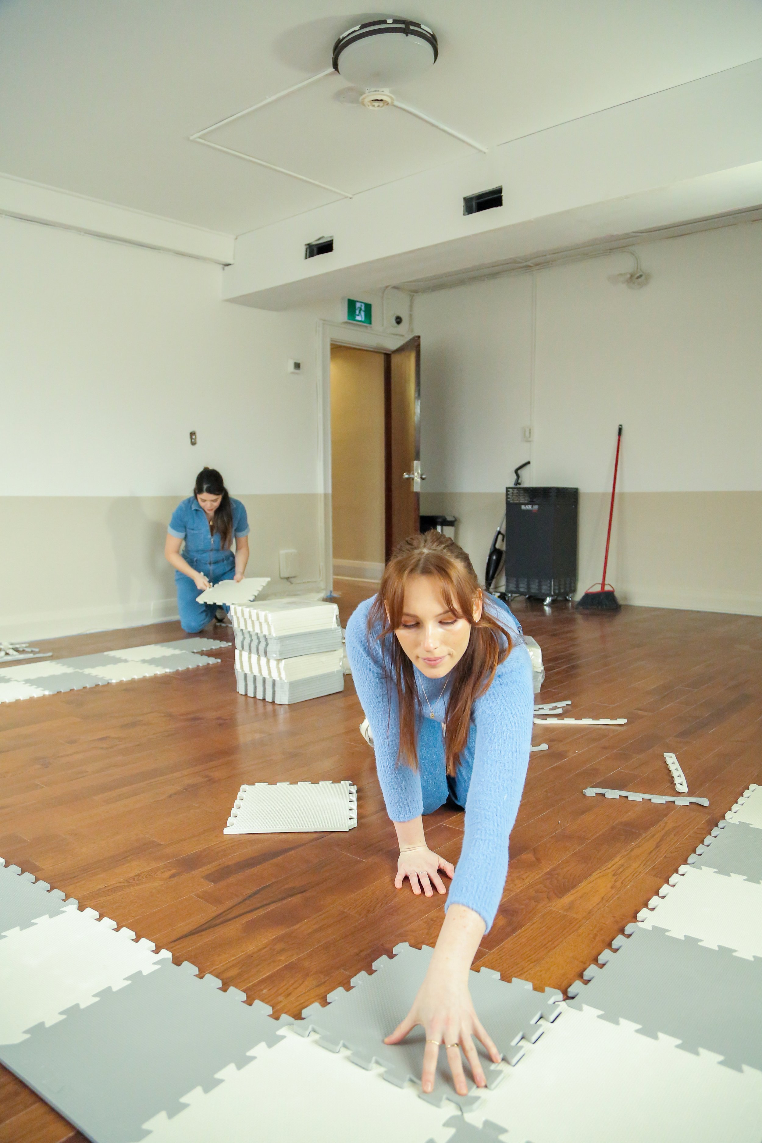
Instead of getting a crazy patterned floor mat, we opted for a checkered pattern one. While this pattern is pretty classic and on trend, it’s also visually stimulating and engaging for the babies while also being comfortable for tummy time. It’s also crucial to find a mat that is easy to clean and maintain, especially with babies and their tendency to create messes, so foam was the best bet for sure.
Next we brought in comfortable and colourful furniture. Choosing furniture with pops of colour not only fit the mood board vibes, but also helps to create a positive and uplifting atmosphere for those who use the space.
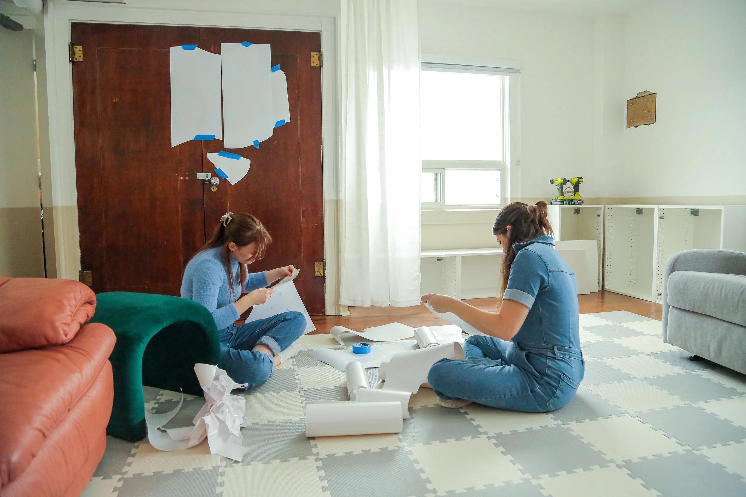
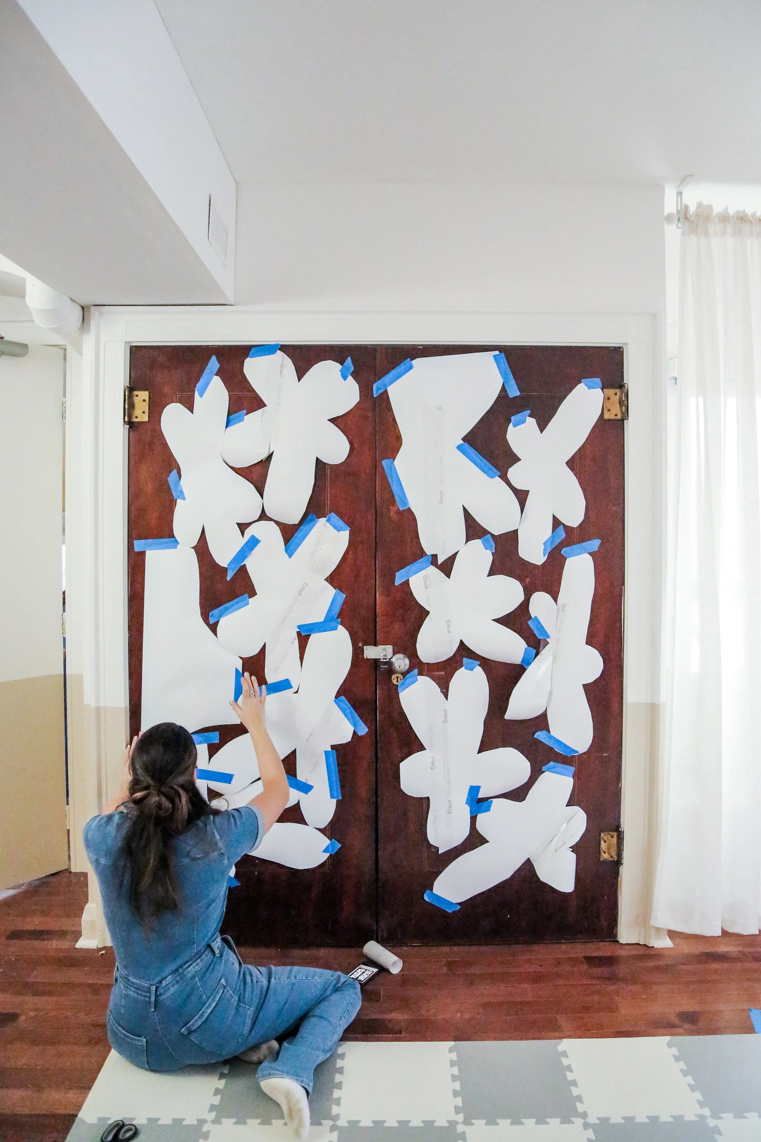
We used our Cricut machine to cut out decals of oblong floral patterns to upgrade the look of a wooden door without having to paint it. The shape of the flowers provides a modern, yet whimsical touch to the doors and adds visual interest without being too overwhelming. This small upgrade was a cost-effective and time-saving solution to add a touch of personality to this space without committing to a permanent painting project.
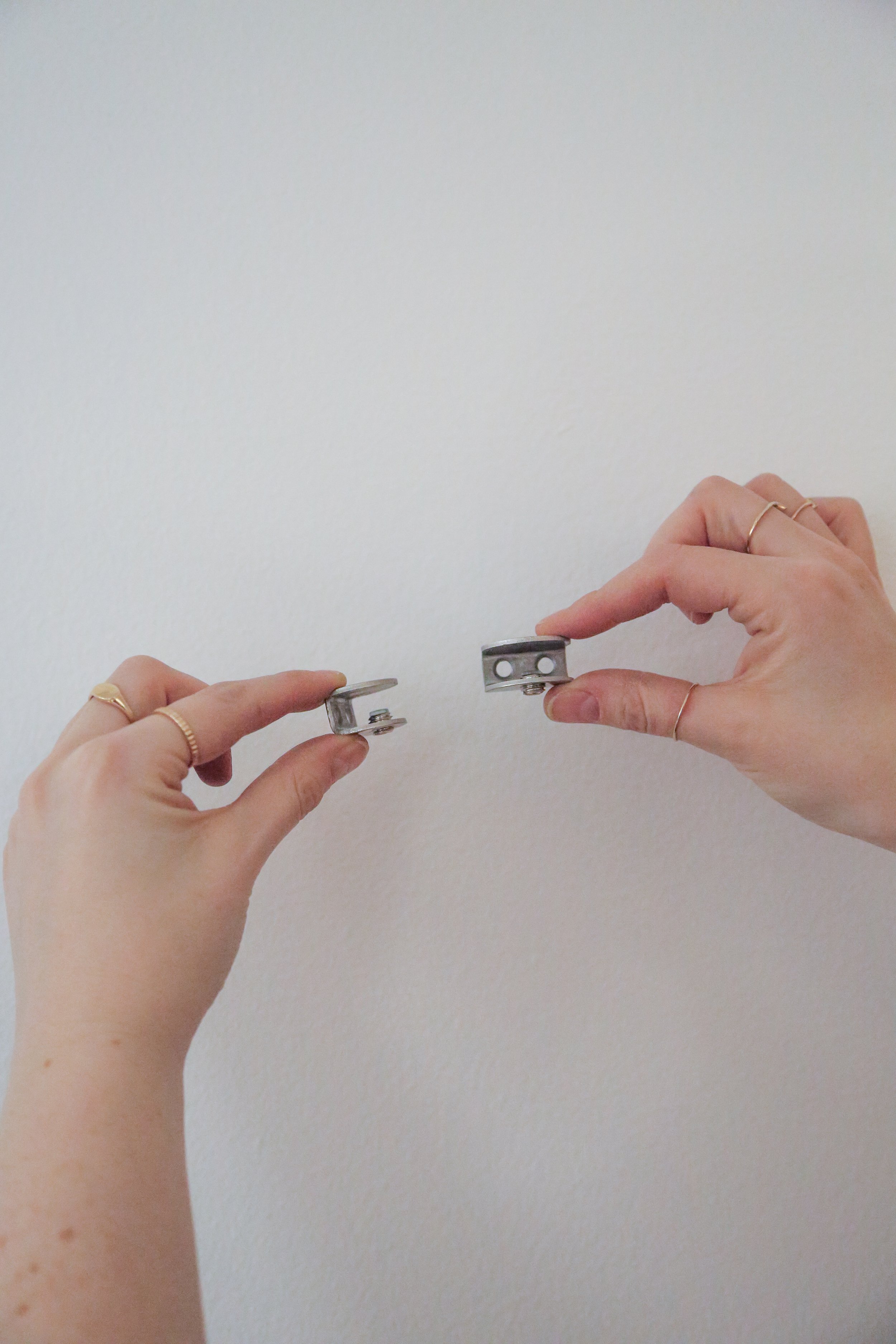
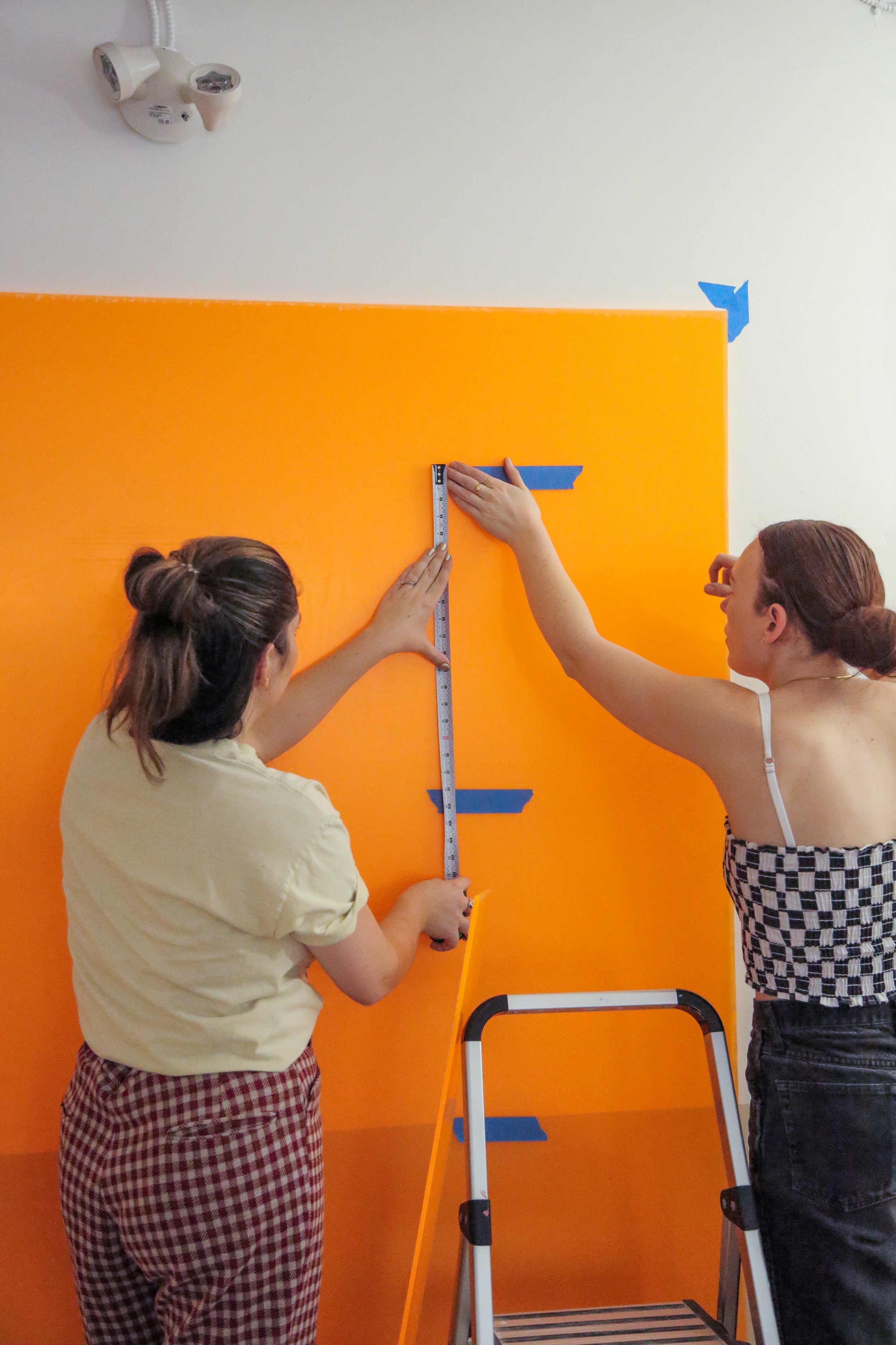
Next we wanted to make a bookshelf out of acrylic sheets. We pre-drilled holes into the acrylic that were slightly larger than the screw so that the acrylic wouldn’t crack. Next, we got glass shelf hooks and used longer screws than what came with the clips so that they would sandwich the sheet of acrylic between the clip and the wall. This was to secure the acrylic backing board to the wall and install the shelf mounting clips all in one step. After that, we had to back out the little set screw on the clip, slip in the acrylic shelf and then tighten the set screw to hold it in place.
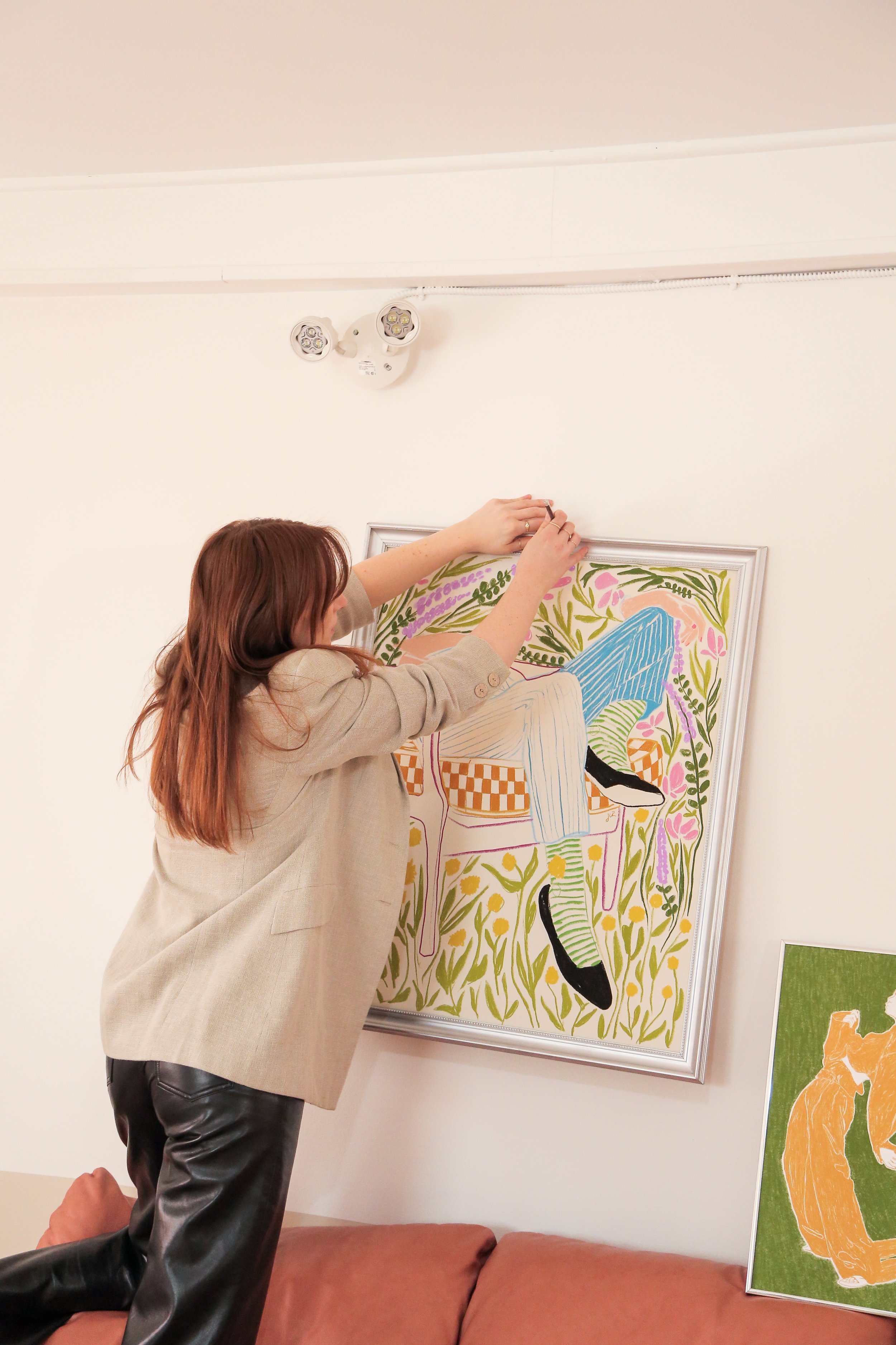
Lastly, we put up some decor up around the room to finish off the look!
Final Results
And thats the makeover, what do you think of the final results!? Watch the full process in the following videos…


