Making A Faux Conversation Pit in my Living Room
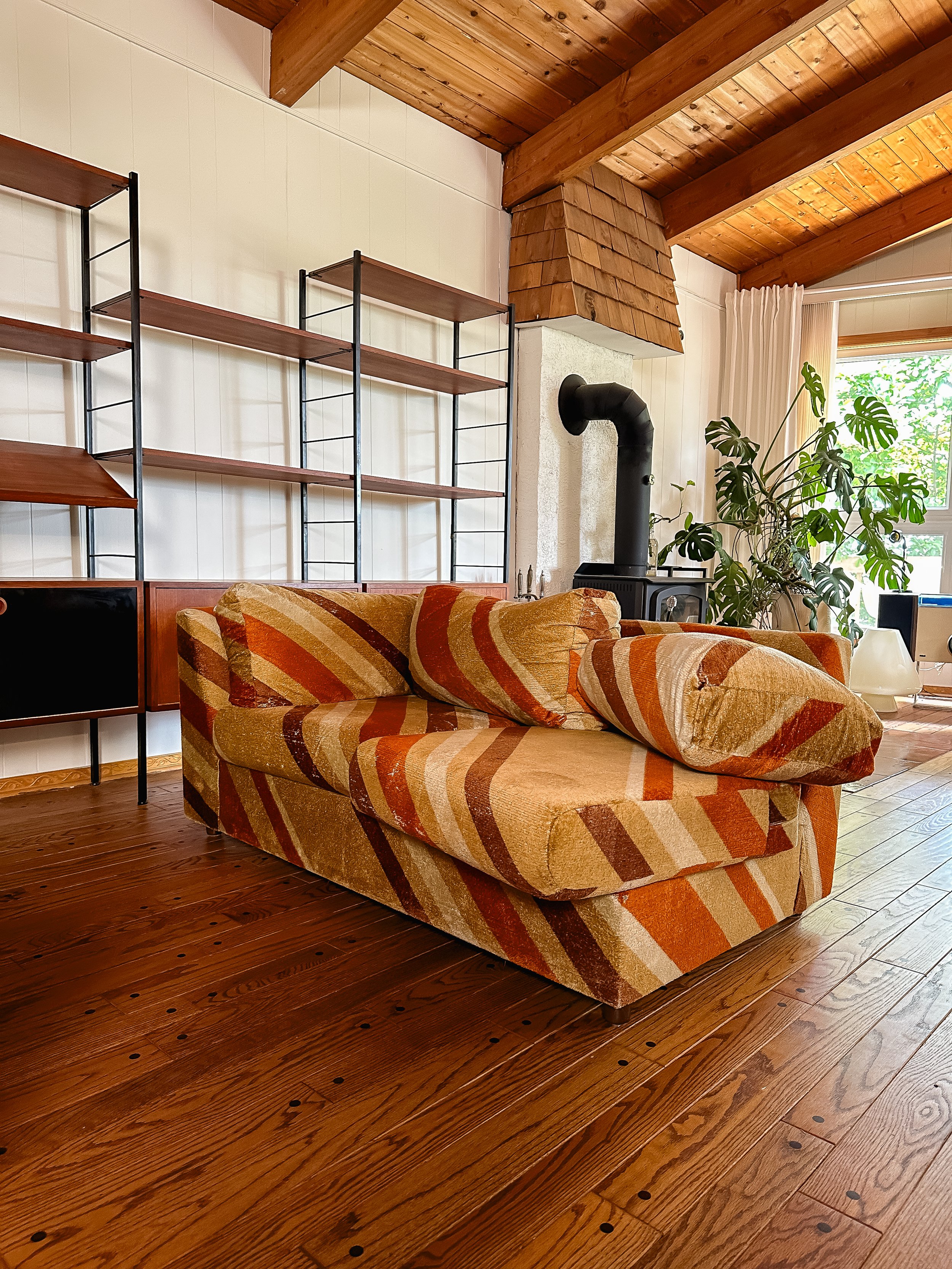
Hey everyone :) Welcome back to another blog post from our series That 70s House. When I first moved into this house, one of the first things I tackled was the dining nook. You might remember it – the striped couch I used actually went viral on TikTok, and had lots of people divided on if they liked it in the space or not. Later on, I decided to switch out the sofa to one that was better suited for the area BUT I definitely did not get rid of the striped one…that $50 marketplace steal from the '60s is too iconic to part with.
(Old dining nook makeover)
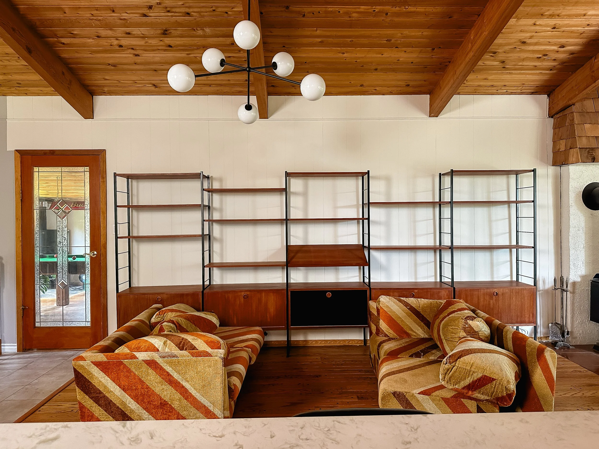
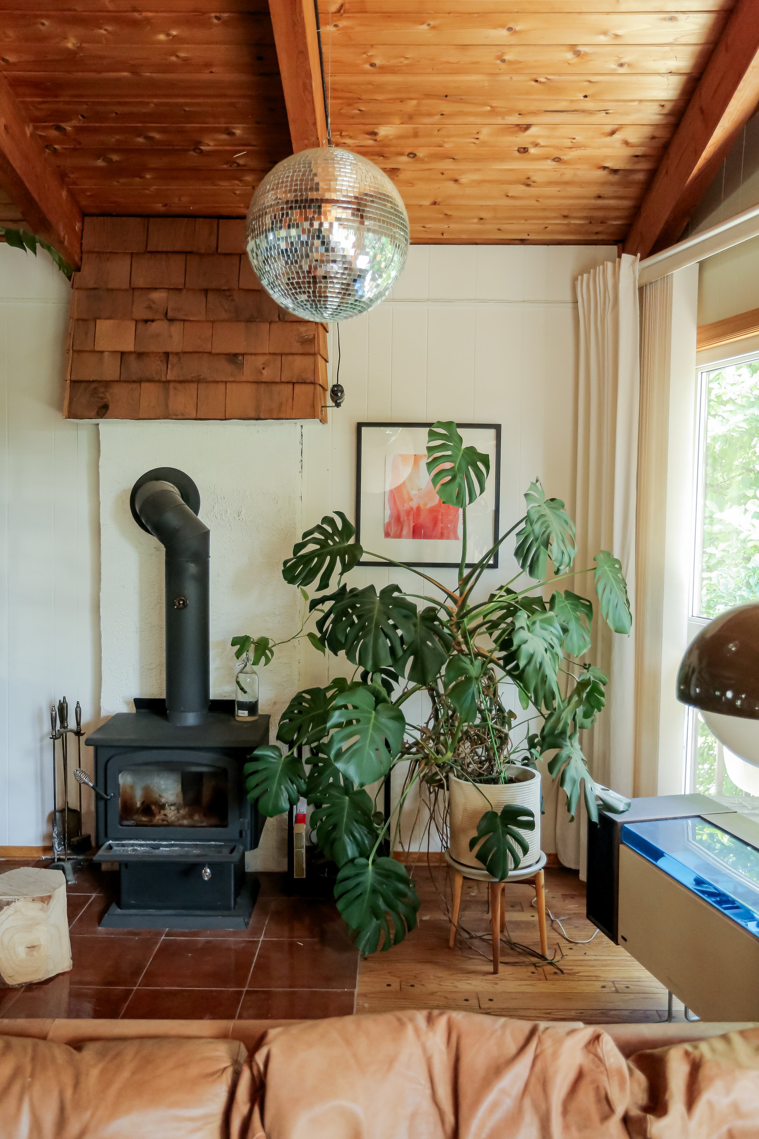
That said, when I switched out the sofa, I put the striped one temporary in an empty space on my main floor. It turns out, this space I created kinda functions like a cool, old-school conversation pit, instead of being entered around a TV, the couches are facing each other, promoting…well…conversation lol. So after living it with a while, we decided to make the placement more permanent and decorate around the couches.
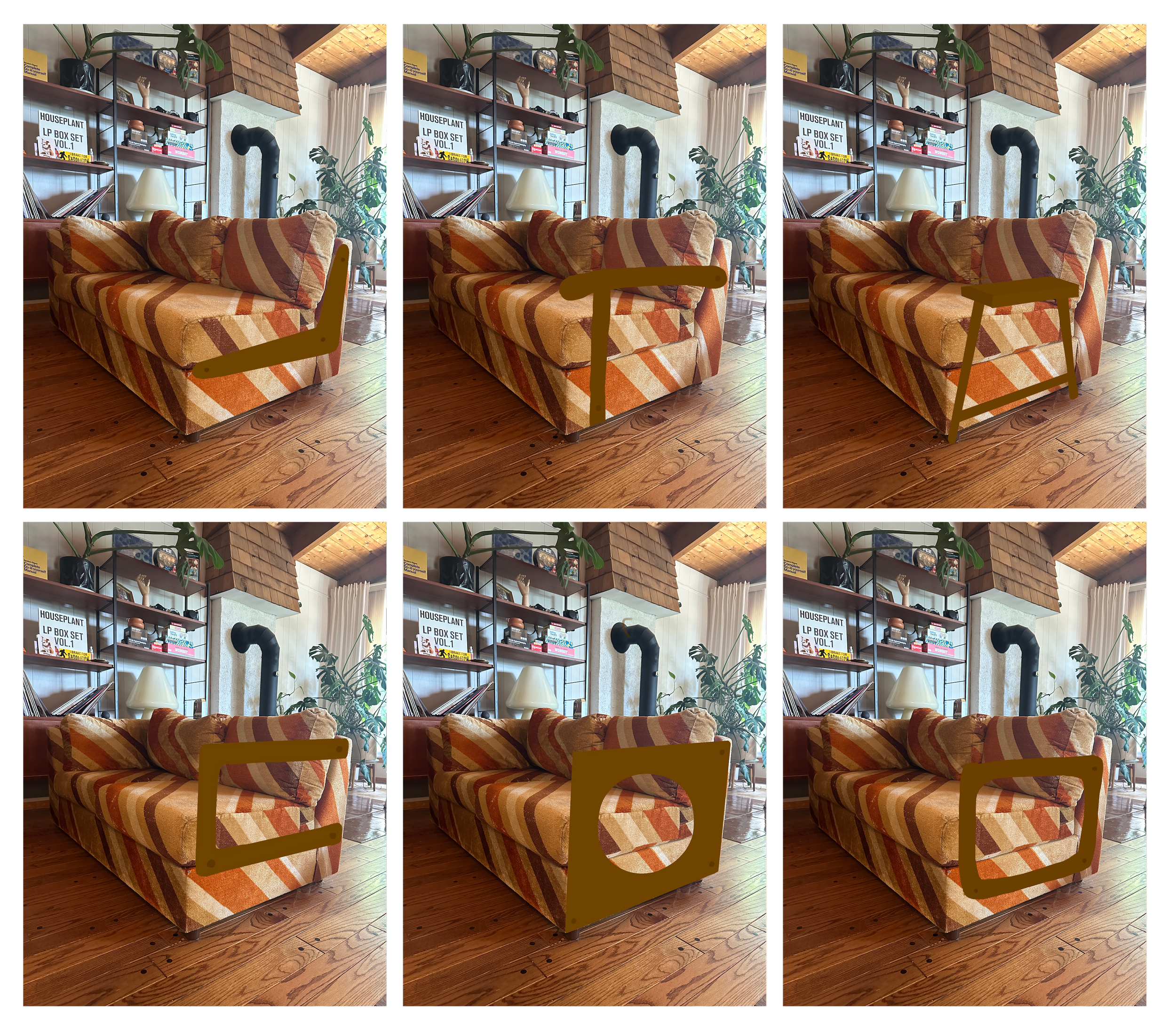
Because the original couch is a sectional, splitting them up meant needed to create a custom arm for the bare sides. I went through a couple iterations of shapes and ideas – triangles, squares, etc. But after mocking some up and even creating prototypes with some spare wood I had, I settled on a minimal design, that didn’t overpower the statement the stripes makes.
Different Iterations
Final Result
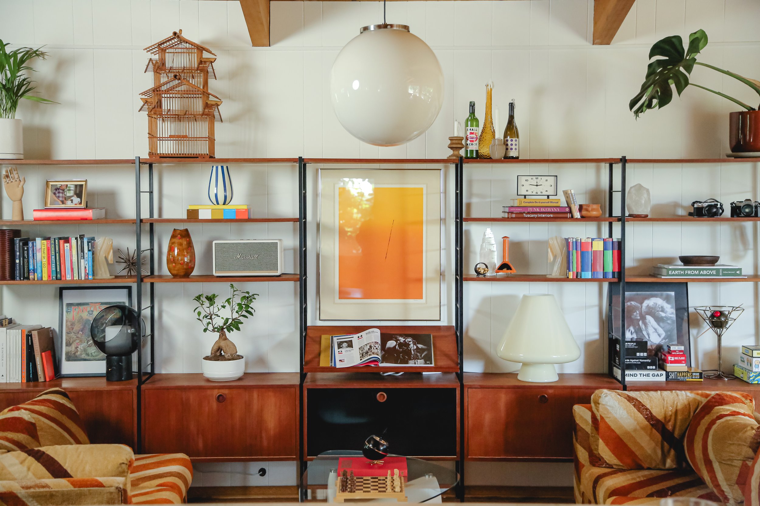
Next, I went thrifting. I found a coffee table that's a statement piece without overshadowing the sofas, modelled after a designer piece by Noguchi. I also scored a beautiful art piece that would fit perfectly within the shelves that were right beside the couches. With these couple new thrift finds, I went around my house and collected items to decorate the shelves, and an old shag rug that I wasn’t using to really make the area defined.
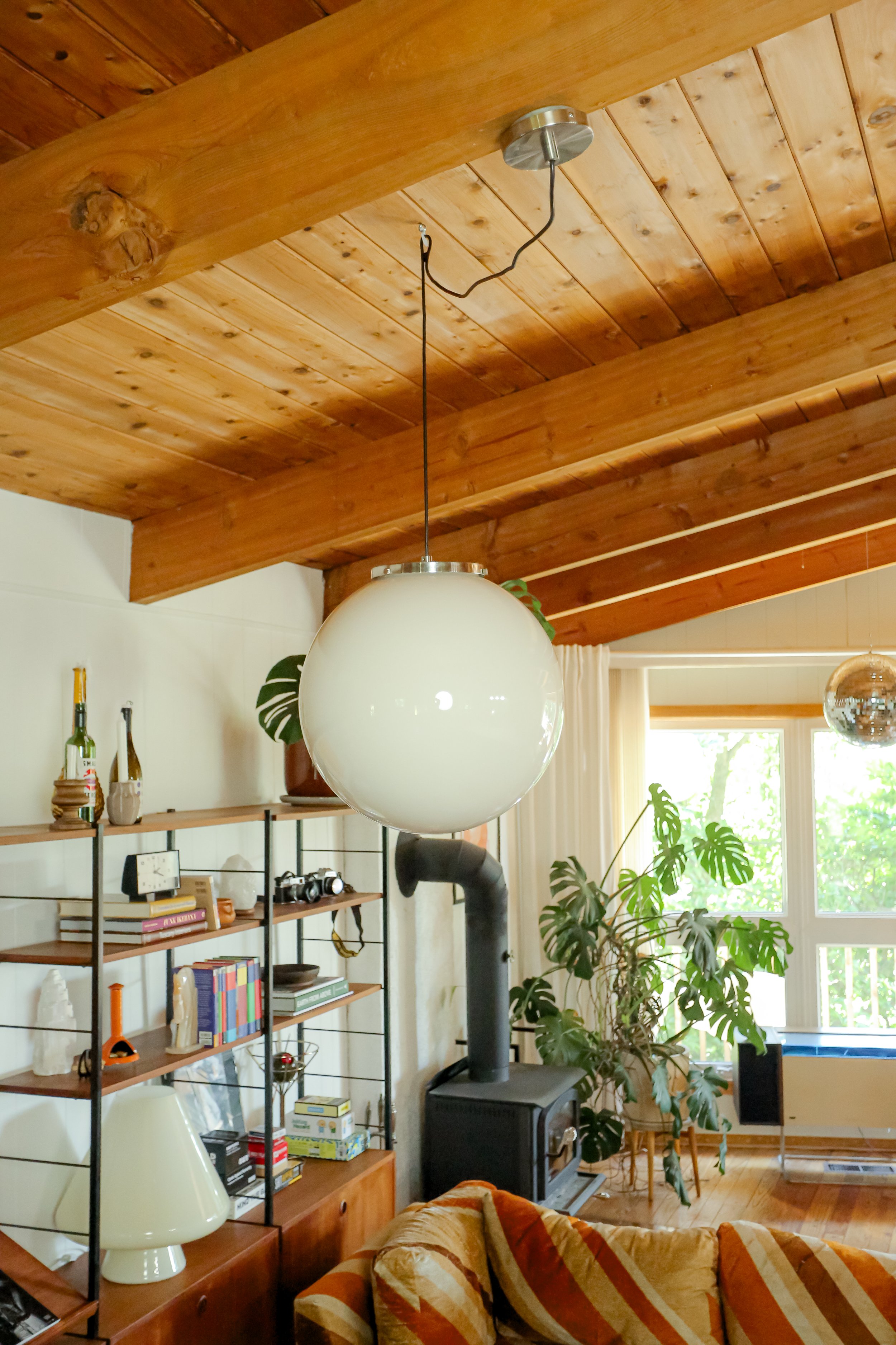
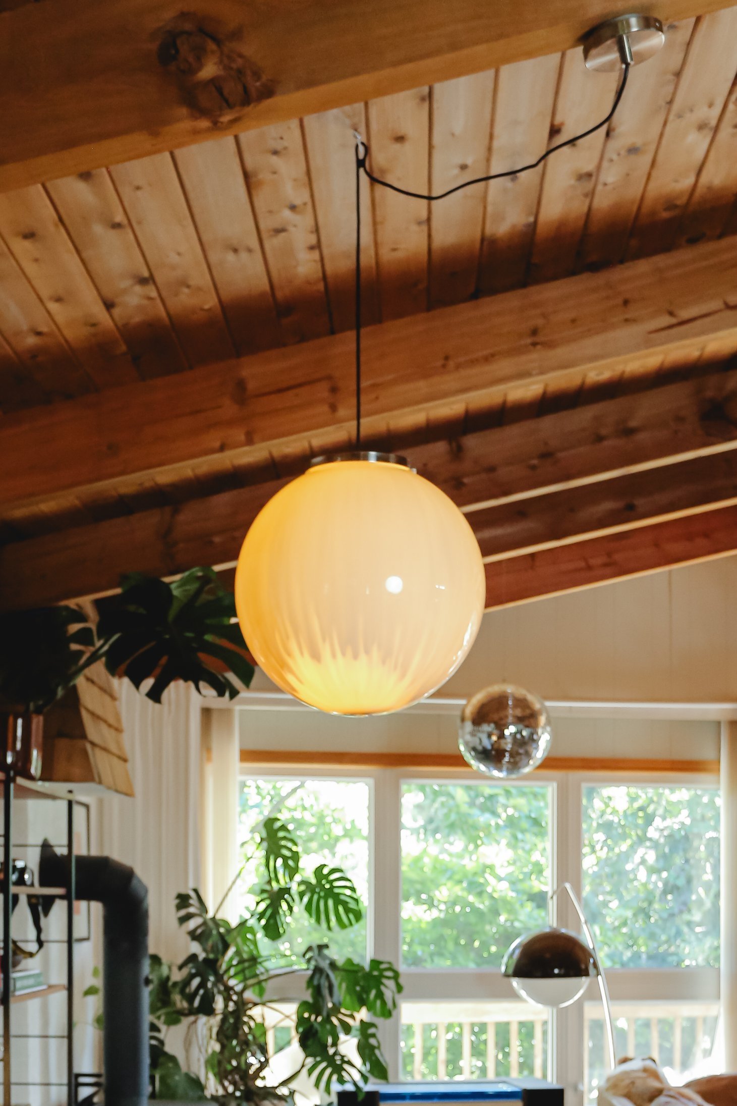
Lastly, I wanted to change my chandelier to a swag pendant, because although cute, it was not centred. I decided to transform a clear pendant light that I had thrifted in the past that is clear acrylic into a smokey white glass effect. I did a pour paint method, and it turned out pretty streaky (when the light is turned on), BUT I actually thing it's a funky piece and I really like how it turned out.
And here are the final results of the whole space! I loved how it all turned out and we’ve already been using it so much! Watch the full episode to see the makeover from start to finish here.


